Smartphone design has many problems because technology changes fast. Designers need to make devices that are fun and new. They also need to make sure people like using them. Almost everyone has a smartphone now. More than 91% of adults in the U.S. use one. Many people feel let down by phones that are too much alike. They want each new phone to be more exciting.
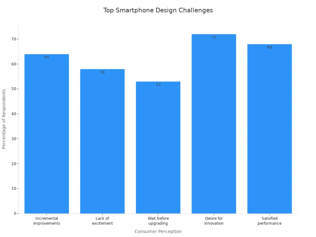
Perception | Percentage of Respondents |
|---|---|
Smartphones offer only small changes | 64% |
New smartphone designs are not exciting | 58% |
People are okay waiting longer to upgrade | 53% |
People want more new features | 72% |
People are happy with how their phones work now | 68% |
Making a new phone now needs careful planning. This helps give people a better experience.
Key Takeaways
Smartphone design is hard because technology changes fast and people want cool new features. Designers need to make phones easy to use. They work to make small screens better. They also make menus simple. Phones should be easy for everyone to use. Battery life and speed are very important. Designers try to keep phones small but with strong batteries. They also make sure the software works well. Many different devices make app building tough. Apps need to look good on all screens and systems. Designers study how people use phones and where they use them. This helps them make phones work well, even in tough places.
Limited Screen Space in Smartphone Design

UI Constraints
Smartphone designers have problems because screens are small. A small screen means less information fits at one time. Designers need to put things in order so users find them fast. They use chunking and clear labels to help people move around. A mobile-first way of thinking helps with small screens. Responsive design lets layouts change for different devices.
Usability experts give tips to fix UI problems. The table below lists some good ways:
Strategy | Description |
|---|---|
Design for multiple devices | Use responsive design to fit many screen sizes and avoid things that do not work. |
Optimize UI performance | Use caching and lazy loading to make the UI faster and give better feedback. |
Simplify UI complexity | Put information in order with chunking and clear labels to make it easier to use. |
Enhance UI accessibility | Give more ways to use the UI and make sure everyone can read it. |
Evaluate UI solutions | Test with users and get feedback to see what works and what needs to change. |
Designers make touch targets bigger so people can tap them. They keep navigation simple and neat to stop confusion.
Prioritizing Content
On a small screen, designers pick what is most important. Mobile-first design puts key information at the top. Task-first design helps people finish what they want to do. Content-first design puts main content where it is easy to find.
Designers take away things that are not needed. They use clear menus and buttons that are easy to tap. Good layouts help people find things quickly. Short headlines and small paragraphs make reading easier. Collapsible sections keep things tidy and help users focus.
Tip: Putting important content first and using collapsible sections helps users find things without getting lost.
Small screens make designers think hard about every part. They must make things easy to use and fun for everyone.
Touch Interaction Challenges
Gesture Design
Smartphone designers have problems when touch is the main way to use devices. They must think about how people swipe, tap, and pinch with their fingers. Research says gestures should feel natural and match what users expect. Designers use ergonomic ideas so gestures are comfortable. They add feedback like sounds to show if a gesture works or not. A clear set of gestures helps users remember what to do and stops confusion.
Usability studies find many touch mistakes. The table below shows common errors:
Error Location | Description |
|---|---|
Near Button Boundaries | Most touch mistakes happen within 2 mm from button edges. |
Below Buttons | Touch mistakes often happen below buttons, no matter the shape or spot. |
Lateral Sides | Touch mistakes on the sides of buttons follow patterns based on where buttons are. |
Designers need to fix these problems to make phones better. They test gestures with real people and change button size and place. This helps lower mistakes and makes phones easier to use.
Accessibility
Accessibility brings special problems for smartphone user experience design. Some people have disabilities that make touch screens hard to use. Designers must fix issues like small touch targets and confusing menus. Moving from keyboards to touch screens can be tough for some users. Multi-touch gestures may need other ways for people who cannot use them.
The table below shows common accessibility problems:
Accessibility Challenge | Description |
|---|---|
Touch area (size) | Many mobile screens do not have touch targets at least 44×44 pixels, making it hard for people with movement problems. |
Custom widgets | Custom widgets can be hard to use if they do not follow normal accessibility rules. |
Interaction paradigm | People used to keyboards may find touch events confusing and hard to use. |
Testing complexity | Many devices and ways to use them make testing for accessibility harder. |
Speech control | Not enough speech control options can make it hard for people with disabilities. |
Zoom functions | Zoom can make text blurry and does not always fit content well, so reading is hard. |
Color contrast | Poor color contrast can make it hard for people with vision problems to see content. |
Font size limitations | Users cannot make font size 200% bigger on iOS and Android, so reading is tough. |
Navigation conventions | No clear rules for showing frames when changing views can confuse users. |
Battery consumption | Using many apps at once uses a lot of battery, which is hard for people who need assistive tech. |
Designers use user experience design ideas to fix these problems. They make touch targets bigger, add speech control, and use better color contrast. They also test with people who have disabilities. These steps help make smartphones work for everyone.
Tip: Designers should always check for accessibility in user experience design so all users can use their devices.
Performance and Battery Issues

Hardware Limits
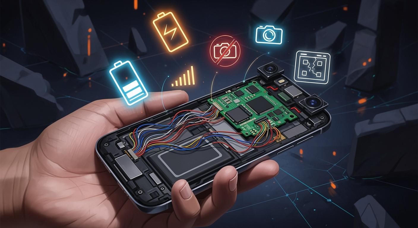
Smartphone design has many problems because of hardware limits. Designers want phones to be thin and light. This means batteries are smaller. Smaller batteries do not last as long. They need to be charged more often. All rechargeable batteries lose power over time. Most smartphone batteries work well for about 850 charges. After that, they drop below 80% capacity. As batteries get older, they hold less charge. The phone also gets slower. This causes more problems and shorter battery life. Designers must choose between battery size, weight, and what users want. Some people want slim phones. Others want longer battery life. Bigger batteries help with speed and loading. But they make the phone heavier and harder to carry.
Note: When batteries get old, phones run slower and do not last as long. People may see these problems after a year or two.
Software Optimization
Software optimisation is important for fixing performance problems. Developers use mobile optimisation to help apps and systems run well. They use special tricks to make batteries last longer. These tricks also keep phones fast. Adaptive battery algorithms learn how people use their phones. They change power use to save battery. Power-saving modes give extra hours when people are busy. Stopping background processes also helps with speed and battery.
Technique | Impact on Battery Longevity |
|---|---|
Optimized Battery Charging | Makes batteries last up to 20% longer in real life |
Ultra Power Saving Mode | Gives more hours when the phone is used a lot |
Adaptive Battery Algorithms | Makes battery last up to 30% longer in real tests |
Mobile optimisation and software optimisation work together to fix problems. Good optimisation makes apps load faster and keeps phones cool. Designers and developers always look for new ways to make phones better. This helps people use their smartphones for a longer time.
Device Fragmentation in Mobile Design
Device fragmentation makes smartphone design much harder. Developers need to check that their apps work on many devices. There are thousands of Android models from over 1,300 companies. Each device has its own screen size, memory, and sensors. This makes it tough to build one app that works everywhere.
Screen Size Variations
Different screen sizes change how people use phones. Designers must think about all these sizes when making apps. They make sure text is easy to read and buttons are easy to tap. Navigation should feel right on both big and small screens. Testing touch targets helps people avoid mistakes. Using fixed pixel sizes can cause problems, so flexible layouts are better. Designers plan navigation for the smallest screens first to help everyone.
Making sure apps work on all devices
Keeping text easy to read on any screen
Building navigation that fits each screen size
Testing touch targets so they work well everywhere
Not using fixed pixel sizes that cause problems
Making sure text is readable with bigger fonts
Planning navigation from the smallest screen up
OS and Hardware Diversity
Different operating systems and hardware make things even harder. Android runs on many phones, from cheap to expensive. Developers must make sure their apps work on all of them. Each system handles hardware and software in its own way. This changes how apps look and work. User experience can be different because of security, customization, and design rules.
Feature | Description |
|---|---|
User Interface | Lets people interact with the device. |
Security | Keeps user data and the device safe. |
App Creation | Helps developers make apps using SDKs. |
Resource Management | Handles the device’s hardware and software. |
Mobile-Specific Features | Adds special features for better mobile performance. |
Android lets people change more things, but this can make apps look different. iOS keeps things the same and simple. Designers for iOS know how their apps will look on all Apple devices. Android designers must deal with many screen sizes and hardware, which is harder.
Tip: Using flexible layouts and adaptive UI helps with device fragmentation. Designers should test their apps on many devices.
Connectivity and Session Length
Variable Network Quality
Smartphones need good connections to work well. People move around and the network can change a lot. Some places have fast Wi-Fi, but others only have slow data. These changes make it hard for mobile-first design. Designers must make apps that still work when the signal is weak. Responsive features help apps adjust if the connection is slow or lost. For example, apps can save your work offline and sync later. Mobile-first design tells developers to test in many network situations. They use tools to copy weak signals and find problems early. Responsive layouts load the most important things first. This keeps users interested, even with slow networks. Mobile-first design also uses small images and simple code. These choices help apps load faster and use less data. Designers make sure every action matters, so users do not get upset by waiting.
Short User Sessions
People use smartphones for short times. Most sessions last just two or three minutes. Mobile-first design must fit this way of using phones. Designers watch how people use apps to see what keeps them interested. Responsive apps show important info right away. They skip long loading screens and hard menus. Mobile-first design puts key actions, like onboarding and buying, at the top. Responsive layouts help users finish tasks fast. Designers track small steps, not just big goals. Many users lose interest and leave before finishing. Mobile-first design uses clear buttons and easy navigation to help users. Responsive features let users start again where they stopped. The table below shows how session length affects mobile-first design:
Metric | Value |
|---|---|
Average session length | 2 to 3 minutes |
User engagement duration | Micro-sessions norm |
Importance of tracking | Intermediate actions |
Mobile-first design strategies include:
Showing key actions first
Tracking small steps, not just big milestones
Making onboarding and purchases easy
Using responsive layouts for fast navigation
Mobile-first design helps users stay focused and finish tasks. Responsive features make apps feel smooth, even in short sessions. Designers use these ideas to fix problems and make mobile use better.
Contextual and Environmental Factors
Mobility and Interruptions
People use smartphones while moving around. They might walk, ride a bus, or sit in loud places. These changes make designing smartphones harder. People get interrupted by notifications or calls. Sometimes, they check their phones just because they are bored. Even short interruptions, like 3 seconds, can cause more mistakes. People also get less work done when interrupted. The table below shows how interruptions hurt users:
Evidence | Description |
|---|---|
Flow State | Users need to focus, but interruptions stop this. |
Impact of Interruptions | Quick breaks cause more mistakes and less work. |
Checking Habit | Many people check their phones every 18 minutes, which breaks focus. |
Designers help users get back to their tasks fast. Good design lets people start where they stopped. This makes using phones easier and stops people from feeling lost.
Environmental Impact on Usability
Things around us change how we use smartphones. Light, noise, and network speed all matter. For example, hospital workers at night need bright screens. People in gyms or on busy streets may not hear sounds from their phones. People in the country with weak signals have trouble loading videos or pictures. These things make it hard to use phones well.
Slow loading, crashes, and battery drain happen more in tough places.
Weather and travel can change how health apps work.
Loud places and bad lighting make it hard to see or hear important things.
Designers must think about these problems when making new phones. They need to test phones in real life to find issues early. By fixing these problems, designers make phones safer and easier for everyone.
Mobile User Experience Challenges
Intuitive UX Design
Smartphone users want apps to be easy to use. Designers try to make mobile user experience simple. People want to finish tasks fast and not get confused. Leading UX groups give rules for good design. The table below lists these important ideas:
Principle | Description |
|---|---|
Simplicity | Show one main task on each screen so users do not feel lost. |
Touch-friendly interfaces | Make buttons big and spaced out so people do not tap by mistake. |
Accessibility | Design for everyone, including people with disabilities, and follow world standards. |
Intuitive navigation | Use familiar ways to move around so users do not have to think hard. |
Consistency | Keep things looking and working the same to help users trust the app. |
Fast load times | Make apps load quickly so people do not leave. |
Designers use these rules to make apps easy to use. They keep screens simple and make buttons easy to tap. Keeping things the same helps users feel safe. Fast loading stops people from leaving. Accessibility lets everyone use their phones.
Single Window Limitations
Smartphones only show one window at a time. This changes how designers build apps. People do not pay attention for long on their phones. Most mobile sessions last about 72 seconds. Desktop sessions last about 150 seconds. Designers need to make every second matter.
Only having one window and short attention spans change how apps are made. Designers must make screens that work alone, show important things first, and keep tasks simple for users who get distracted.
To help users, designers do these things:
Make each app or website work alone so users finish tasks without switching.
Save progress so users can come back after getting interrupted.
Make it easy to return to the app or website so users do not get upset.
Designers focus on what matters most and keep actions simple. They know users might get distracted. By saving progress and making it easy to come back, designers help users finish tasks. These ideas help users even with short attention spans and only one window.
Impact on Electronic Design and Manufacturing
Miniaturization and Component Density
Smartphone makers want devices to be thin and light. This makes designing the PCB much harder. Engineers use special machines to put tiny parts on the board. Small parts need new ways to fit inside the phone. Boards get crowded, so putting them together is tough. Designers must make sure the phone works well and lasts long.
Thermal Management in PCB Design
Heat builds up fast in packed smartphone PCBs. Keeping the phone cool is important for safety. Engineers use different ways to lower the heat:
Strategy | Description |
|---|---|
Thermal Vias | Small holes move heat from hot parts to cooler layers. |
Heat Sinks | Mini sinks take heat away from important parts. |
Vapor Chambers | Thin chambers use liquid and vapor to move heat. |
Dynamic Thermal Management | Systems slow chips or change tasks to cool down. |
Thermal Interface Materials | Special stuff fills gaps to help heat move out. |
Material Selection | Strong, heat-moving materials like aluminum or graphene help cool. |
New ideas use nanomaterials, AI, and built-in cooling. These help keep phones safe and easy to hold.
Signal Integrity and Layer Complexity
Modern smartphones use PCBs with many layers for more features. This makes it hard to keep signals clear. More layers can cause mistakes and signal problems. Power must reach every layer for the phone to work well. Crowded boards can mess up signals with interference. It is hard to find problems because wires hide inside layers. Engineers use X-ray tools to look for faults. Fixing these boards often means changing the whole PCB, which costs more.
Manufacturing Challenges and Quality Control
Making advanced smartphone PCBs needs careful checks. Problems include missing solder masks and acid traps. Uneven copper can bend boards during building. Hard designs make making phones slower and tougher. Makers use special rules to build faster and better. Bad soldering and tiny bits can cause shorts or weak links. Careful work and checks help stop these risks. Teams test real phones to find problems early and make sure users are happy.
Best Practices for Mobile Design
Consistency and Simplicity
Designers have many problems when making mobile-first designs. They need to use good ways to help people use apps easily. Keeping things the same helps users trust the app. It also helps them learn fast. Simple screens are easy to use and understand. Designers use easy navigation so people do not get confused. Clear buttons and common patterns make moving around simple.
Show the most important things first so users see them.
Easy menus at the bottom and clear back buttons help people.
Big, bright, and spaced-out things guide where people look.
Using the same fonts and colors makes users feel safe.
Simple designs mean every part has a reason and no extra stuff.
Mobile-first design tells designers to take away things that are not needed. Responsive design changes layouts for different devices. Clean screens and simple navigation help users finish tasks quickly.
Tip: Designers should always make sure navigation is easy and the same on every screen.
Staying Updated with Trends
Mobile design changes fast. Designers need to know new trends and tech to keep apps good. Top designers read news and learn new mobile-first ideas. They watch for changes in how people use apps.
Source | Key Insight |
|---|---|
Mobile Technology Waves for 2025 | Knowing new mobile tech helps businesses give people what they want. |
Mobile App Design Trends to Follow in 2024 | Learning new design ideas helps apps work better for users. |
Mobile App Trends for 2025 and Beyond | Good design and easy use help apps get more attention. |
Responsive and mobile-first design help designers change for new devices and needs. Designers try new things and update their apps often. They listen to feedback and watch how people use their apps. Keeping up with changes helps designers fix problems and make better mobile apps.
Smartphone design has many problems that change how people use them. Research shows that good design makes phones easier and more reliable to use.
Study | Findings | Implications |
|---|---|---|
Tractinsky et al. (2000) | Looks of a phone change how easy it feels to use | Shows that better design can make using phones nicer |
Thielsch et al. (2019b) | Good looks help people use phones better (g = 0.12) | Means that nice design can make phones work better |
Online Experiment | Cool-looking apps make people feel better and do better | Proves that design problems change how people use and trust phones |
New ideas keep changing what smartphones can do:
Artificial intelligence helps make phones fit each person.
Foldable displays let phones do more things.
Recycled materials help save the planet.
Self-healing polymers fix small scratches.
Graphene composites make phones tougher.
Designers always look for new ways to fix problems and make phones better for everyone.
FAQ
What is the biggest challenge in smartphone design?
Designers have lots of problems to solve. Small space and battery life make adding new features tough. They need to balance phone size, speed, and what users want.
How do designers test smartphone usability?
Teams ask real people to use new phones. They watch how users tap, swipe, and read things. Feedback from users helps make the design better.
Why do smartphones need thermal management?
Smartphones get hot when people play games or watch videos. Engineers put cooling systems in phones to keep them safe and comfy.
How do designers make smartphones accessible?
Designers use bigger buttons and clear text for everyone. They add voice controls and test with people who have disabilities. Accessibility makes smartphones easier for all users.
What is device fragmentation?
Device fragmentation means phones have different screens and systems. Designers make flexible layouts so apps work on every device.