You should first think about what you want from a mobile phone solution. Most people use their phones to go online now.
In October 2024, 60.4% of web traffic came from mobile devices.
In the U.S., about 15% of adults only use mobile devices for internet.
In India, 81.67% of internet traffic is from mobile devices.
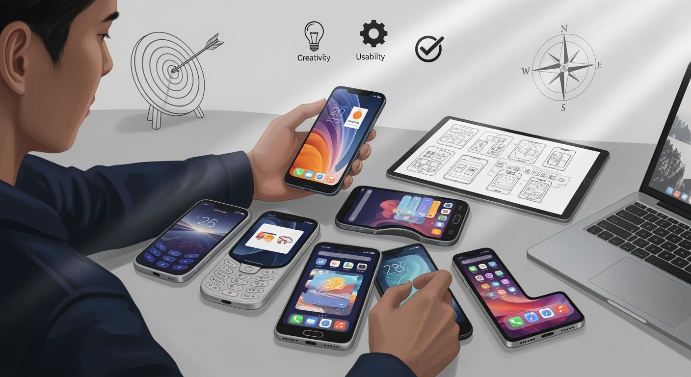
If you know about mobile-first design, you can make sure your ideas work well for users. Mobile-first design helps you make fast and easy experiences. Many people leave a site if it loads slowly or is hard to use. When you focus on mobile app design and mobile-first design, you make users happier and have a better chance of success with any mobile app design.
Key Takeaways
Find out what your users need. Make a mobile-first design that fits their habits and likes.
Make clear goals with the SMART framework. This helps guide your mobile phone solution and makes it work well.
Think about personal and business use cases. Design an app that many people will like.
Test your mobile-first design with real users. This helps you find problems early and make the experience better.
Pay attention to accessibility. Make sure everyone can use your app, even people with disabilities.
Define Your Needs for a Mobile Phone Solution
Identify User Requirements
Start by learning what mobile users want. Many people use their phones for over five hours each day. Some use them for more than seven hours. There are users on both iOS and Android. You should think about both platforms when you plan. Most people want easy ways to do finance, shopping, and entertainment. You need a mobile-first design that works well for these things.
Mobile-first design means you focus on what users do most. Age, culture, and education change what people expect. Young users like fun and lively designs. Older users want simple and clear looks. People from different places have their own habits and languages. Your mobile phone solution should fit these needs. If you want everyone to use your app, add features for people with different abilities.
Tip: Think about what your users do every day on their phones. This helps you make a mobile-first design that meets real needs.
Set Design and Business Goals
You need clear goals for your mobile phone solution. Good goals help you stay focused while you design. Use the SMART framework to set goals that are specific, measurable, achievable, relevant, and time-bound. This method makes you more likely to reach your goals. Make sure your goals match your business plans.
Goal-Setting Criteria | Description | Impact on Success |
|---|---|---|
Specific | Clear objectives remove confusion. | Makes actions easier to plan. |
Measurable | Lets you check your progress. | Helps you see if you succeed. |
Achievable | Makes sure goals are possible. | Keeps your team working hard. |
Relevant | Matches your business dreams. | Helps your business do well. |
Time-bound | Sets a deadline for action. | Helps you finish on time. |
SMART Framework | A way to set good goals. | You are more likely to succeed. |
Use your resources wisely and plan your design steps. If you use frameworks like OKR, you can track your progress and make better choices. When you set goals for mobile-first design, you help both your users and your business.
Consider Enterprise and Personal Use Cases
Think about how your mobile phone solution will work for personal and enterprise needs. Personal users want apps that look nice and are fun. Enterprise users need tools that help them work faster and safer. Your design should include both kinds of users.
Aspect | Enterprise-Focused Design | |
|---|---|---|
User Experience | Focuses on looks and fun | Focuses on work and tasks |
Design Principles | Uses cool UI and feedback | Uses basic UI/UX building blocks |
Overall Objectives | Makes users happy and entertained | Helps users finish tasks |
Pick the right deployment model for your mobile phone solution. Some companies let workers use their own phones. Others give out company phones. Each model has different rules for safety and management.
Deployment Model | Ownership | Management | Security | User Flexibility |
|---|---|---|---|---|
BYOD | Employee | Limited | High | High |
CYOD | Company | Moderate | Moderate | Moderate |
COPE | Company | Full | Moderate | High |
COBO | Company | Full | Very High | Low |
Look at how integrated circuits and reference designs affect your needs. These parts help you build phones that work well and last longer. Good reference designs make your mobile phone solution faster and safer for all users.
Note: Always test your mobile-first design with real users. This helps you find problems early and make your design better.
Mobile-First Design Principles and Approach
What Is Mobile-First Design?
Mobile-first design starts by thinking about how people use phones. This way, you plan for mobile devices first. In the last ten years, mobile-first design changed how apps and websites are made. Companies that use this method connect better with users. You focus on the most important features for mobile devices. This helps users get what they need fast. Mobile-first rules help you put important content first. They also help you keep things the same on all devices. You make sure everyone can use your app or site. You also make the user interface simple and quick. Mobile-first design lets users fix mistakes and see feedback for every action.
Put the most needed content first
Keep design the same on all devices
Make sure everyone can use it
Make actions simple and quick
Show feedback and let users fix mistakes
Benefits of a Mobile-First Approach
Mobile-first design has many good points. Users are happier and keep using your app. People like fast and easy ways to use their phones. Companies see more people using their apps and spend less money. For example, companies save time and money. Each worker can save up to 45 minutes. Service calls can cost 20-30% less. First-time fix rates go up by 25-35%. Response times get faster too. Mobile-first design helps you make simple websites that work everywhere.
Metric | Improvement Percentage |
|---|---|
First-time fix rate | 25-35% increase |
Resolution time | 20-30% faster service |
Administrative efficiency | 45+ minutes saved |
Response time | 20-30% improvement |
Revenue per technician | 15-25% increase |
Cost per service call | 20-30% reduction |
Mobile-First Website Essentials
You should focus on key things when making a mobile-first website. Putting important content first helps users find what they need fast. Touch-friendly ui makes menus and buttons easy to use. Fast loading makes sure your site works quickly. Mobile-first websites must also work on bigger screens. They should be easy for everyone to use. Use clear fonts, good contrast, and simple menus. Mobile-friendly design helps people with disabilities. You should follow rules like WCAG 2.1. Do not add too many things on the screen. Make sure every user can use your site.
Feature | Description | Importance |
|---|---|---|
Content Prioritization | Focus on the most important information | Ensures quick access to details |
Touch-Friendly Design | Menus and buttons for easy interaction | Enhances user experience |
Performance Optimization | Fast loading times | Meets user expectations for speed |
72% of people with disabilities have smartphones. This shows why mobile-first websites must be easy for everyone to use.
Mobile App Design Tools and Solutions
Top Mobile App Design Platforms
There are many platforms for mobile app design. Each platform helps you make apps with mobile-first design. Some let you build for iOS and Android at the same time. Here are some popular choices:
Alpha Anywhere helps you build apps fast with low code.
Flutter gives you tools to make native apps with custom widgets.
Mendix lets you create enterprise apps quickly.
Xamarin uses C# for apps on different platforms.
Unity Ads puts video ads in mobile games.
Ionic is open-source for hybrid and web apps.
React Native uses JavaScript for native apps with one codebase.
Sencha builds apps with lots of data using JavaScript.
Adobe PhoneGap makes apps that work on all devices.
NativeScript helps you use less code and load apps faster.
Swiftic has an easy interface for making iOS apps.
These platforms help you design mobile apps with features like real-time updates and simple interfaces. You can use these tools to keep your app fast and easy.
Tip: Check if your platform follows iOS Human Interface Guidelines or Android Material Design. This makes your app look and feel right for users.
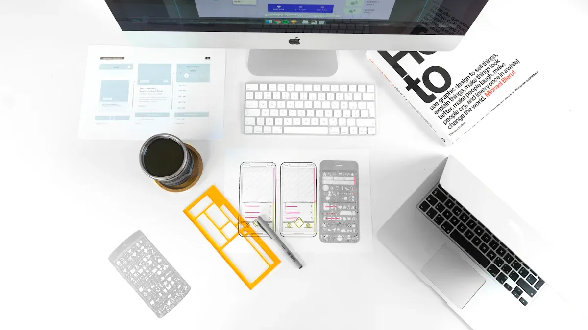
Using Mockup Generators
Mockup generators are important for mobile app design. They let you see your ideas before building the real app. You can test your mobile-first design early. You get feedback from users and change things before spending too much time or money.
AI mockup generators make good designs in minutes.
You can change parts of the design and see updates fast.
Prototypes help you test with real users and get feedback.
Mockup generators help your team work together. You can edit designs at the same time and share links for feedback. It is easy to give specs to developers.
Feature | Description |
|---|---|
Teams work together and stay updated. | |
Easy feedback collection | People leave comments on the design with one link. |
Simple handoff | Automated specs help developers start building the app easily. |
Mockups help you avoid mistakes and make your design process better.
Cross-Platform Design Tips
Mobile-first design helps your app work on all devices. Cross-platform design has problems like many screen sizes and features. AI-driven tools help by changing code and UI for each device.
Use native parts and less resources to make your app faster.
Test your app on real devices and use automated tests.
Keep your app safe with data encryption and strong authentication.
Update your app often to fix bugs and add new features.
Track analytics to see how users use your app.
Mobile-first design keeps your app simple and quick. You can reach more users and give everyone a good experience. App design tools help you handle different devices and keep your app strong.
Compare and Evaluate Mobile Phone Solutions
Key Features to Assess
When you compare mobile phone solutions, look at many features. Each feature changes how users feel about your app or website. You want your design to support mobile-first design and be easy to use. The right features help users trust your app and come back.
Feature | Description |
|---|---|
Colors affect how users feel. Good colors help people read and see better. | |
Typography | Clear text is easy to read. Good typography helps users understand messages. |
Layout | Simple layouts help users find things fast. Easy layouts make users want to return. |
Personalization | Personal touches make users feel special. Custom experiences help users stay and use your app. |
User Experience | Smooth journeys help users finish tasks. Easy elements make your app simple to use. |
You should also check performance, camera systems, battery life, and screen display. Experts use tools like Procyon benchmark suite, 3DMark, and PCMark to test these features. Manus AI looks at official websites and tech forums for new device specs. You get analysis on performance, camera, battery life, and user experience. User intent parsing helps you compare devices for your needs.
Tip: Match your features with what your users need. Mobile-first design helps you focus on the most important things.
Usability and Scalability
Usability means how easy it is for users to do tasks. You want users to finish tasks quickly and make few mistakes. You can measure usability with different metrics:
Completion rate: How many users finish a task.
Time on task: How long users spend on a task.
Fail rate: How many users quit before finishing.
Satisfaction scores: How happy users are after using your app.
Error rates: How often users make mistakes.
Help requests: How many times users ask for help.
Misclick rate: How often users tap the wrong button.
System Usability Score (SUS): A score that shows overall usability.
Scalability means your solution can grow as more users join. You want your mobile-first design to handle lots of users without slowing down. Good scalability planning saves money and keeps users happy. If you ignore scalability, you may need expensive redesigns later. Platforms like Friendster and Myspace lost users because they did not plan for growth. Planning early helps your app grow and stay good.
Source | Key Insight |
|---|---|
Appinventiv | Scalability planning saves money and keeps users happy. |
Marutitech | Platforms that ignore scalability lose users and become less popular. |
Netguru | Early planning helps apps grow without hurting user experience. |
Note: Test your app with real users. Mobile-first design helps you find problems early and fix them before launch.
Accessibility and User Experience
Accessibility means everyone can use your app or website. You need to follow mobile-first design rules to help users with disabilities. Many challenges can stop users from enjoying your app.
Accessibility Challenge | Description |
|---|---|
Small buttons are hard for some users to tap. | |
Gesture Interactions | Hard gestures confuse many users. |
Missing Error Messages | No clear error messages make it tough for some users. |
Audio and Video Barriers | No captions or transcripts block users who cannot hear. |
CAPTCHA Challenges Without Alternatives | Image CAPTCHAs exclude users who cannot see if no other options exist. |
Unlabelled Buttons and Links | Screen readers cannot read buttons or links with no labels. |
Motion Sensitivity Issues | Flashing parts can cause seizures. No motion reduction hurts sensitive users. |
Resizing Text and Pinch and Zoom | Apps that ignore font size settings make reading hard for some users. |
You want a design that works on all devices. Good optimization helps your app load fast and work well for everyone. Avoid common mistakes:
Not doing user research means your app misses what users want.
Making the interface too hard confuses users.
Ignoring platform rules makes users upset and your app may get rejected.
Not caring about performance makes users leave.
Ignoring accessibility leaves out users with disabilities.
Making UX too hard makes navigation confusing.
Too much design makes the screen messy.
Real examples show that good mobile phone solutions focus on performance, camera, battery life, and screen display. Use mobile-first design to guide your choices. Responsive and mobile-first design help you reach more users and keep them happy.
Tip: Listen to user feedback. Mobile-first design helps you make a friendly app and avoid mistakes.
Picking the best mobile phone solution means you need clear goals. If your choice fits your business needs, you work better, help customers more, and save money. You can use mobile-first design by doing these things:
Write down your content and put it in order.
Draw simple wireframes for phones.
Make buttons and links easy to tap.
Add things that work on bigger screens.
Try new tools and learn good ways to design. This helps you make smart choices and build solutions that help all users.
FAQ
What is mobile-first design?
Mobile-first design means you start by making your app or website for phones. You focus on what users need most on small screens. This helps you create a better experience for everyone.
How do I choose the best mobile app design tool?
You should look at what features you need. Check if the tool works for both iOS and Android. Try free versions first. Ask for feedback from your team. Pick a tool that fits your skills and project size.
Why does accessibility matter in mobile design?
Accessibility lets everyone use your app, including people with disabilities. You help more users and follow legal rules. Good accessibility also improves user experience for everyone.
What are common mistakes in mobile phone design?
Many people forget to test on real devices. Some use small buttons or hard-to-read text. Others ignore user feedback. You should avoid these mistakes to make your app better.